
Getting Started Building AI Apps in Sigma
February 9, 2026
AI & SaaS: The future is here
February 27, 2026Scatterplot Aggregations in Sigma
At Maverick Data, we love Sigma. More importantly, we love learning about Sigma and spreading those learnings to our fellow Sigma users.
This week, one of our clients was trying to build a scatterplot to show a comparison of two different metrics at a certain level of aggregation. At first, we thought the answer was very simple and straightforward – but it proved otherwise.
To get scatterplots to aggregate correctly in Sigma, you need to use a couple of specific calculations.
The Use Case
Our data set has a list of items sold that includes their sales as well as cost of production. The client needed to aggregate these items at different levels to identify outliers in product cost vs. sales price. They also wanted to be able to do this aggregation by various categories.
If you were to create a scatterplot and drag sales to the x-axis and product price to the y-axis, you would get something like below.

Even if you built in-axis calcs using SUM(Sales) and SUM(Product Price), it would still not show the desired outcome. Let’s walk through how to get you to your desired outcome.
Solution
There a couple of different ways to accomplish the aggregated scatterplot that we’re after. The first method would be to create an aggregated table element that includes the aggregated fields by our desired hierarchy field – you can see the example below.

There are two main issues with this:
- It creates a new child element that is solely used for one visual. While this is not inherently wrong, it does add unnecessary complexity to your data tables in the workbook.
- Unless you change the hierarchy column dynamically (requiring more development complexity), you are stuck using that level of granularity in your scatterplot.
The other alternative is to use the Subtotal() syntax in an in-line calculation. Head to Properties > X-Axis > Add column > Add new column. Subtotal() will ask for a field aggregation, the hierarchy to aggregate to, and a parameter if needed. The parameter specifies which levels of aggregations to ignore in the context of the calculation if you are using this calculation in a table of pivot table.
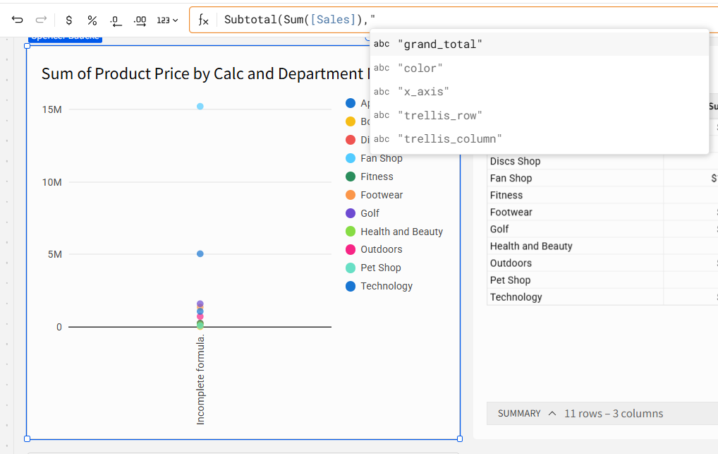
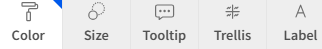
Because we are using this calculation in a visualization, we are able to choose the Subtotal aggregation from fields in our visualization formatting. Those options are listed below.
Because we are adding our aggregation field to the Color formatting area, we are going to include this in our syntax.
Subtotal(Sum([Sales]), “color”) and Subtotal(Sum([Product Price]), “color”)
Now that we’ve added those fields to our scatterplot, you can see that the chart below is showing as desired.

One final note here – you could easily create dynamic aggregations by using a calculated field to color the scatterplot. Create a control that uses text values to refer to the different fields used in your dataset. See calculation below:
Switch([Dynamic-Plot], “Department Name”, [Department Name], “Product Name”, [Product Name], “Shipping Mode”, [Shipping Mode])

Now when you change your filter control, your scatterplot dynamically calculates the new subtotals at the new aggregation.
Conclusion
While this is far from our most complex use case on the Maverick Data blog, we still wanted to share this Sigma workaround because it highlights how calculation context works inside visualizations. Scatterplots don’t automatically aggregate the way you might expect, but the Subtotal() syntax lets you control exactly how Sigma groups your measures within the chart. Pair that with a dynamic Switch() dimension, and you can instantly re-aggregate your scatterplot at different levels with a single control.
Contact Us
If you would like to talk to someone at Maverick Data about maximizing your usage of the Sigma platform, please email us at spencer@maverickdata.io for more information!