
Paste-in Filters in Sigma
December 5, 2025
How Sigma’s AI Apps Are Changing BI
December 14, 2025Sigma Sparklines
Using SparklineAgg and “Add Column via Sparkline”
Most Sigma workbooks start as plain KPI tables: one row per product, store, or region with a few aggregated metrics. That tells you where the metric is today—but not how it got there.
In this tutorial you’ll learn how to add sparklines in Sigma so each row shows its own mini trend chart. We’ll:
- Use the Sigma Sample Database and its Plugs Electronics demo data.
- Work specifically with the
PLUGS_ELECTRONICS_HANDS_ON_LAB_DATAtable. - Build two sparklines per Product Type:
- Revenue trend
- Profit trend
- Show both approaches:
- The
SparklineAggfunction - The “Add column via → Sparkline” workflow
- The
By the end, you’ll have a compact table element with sparklines that are actually useful.
Why Use Sparklines in Sigma Tables?
Sparklines inside Sigma tables and pivot tables are useful when the goal is to see:
- Per-row context: One mini chart per group (for example, per Product Type)
- Minimal extra space: Trend information added without introducing a separate chart element
In Sigma, sparklines can be created by:
- Using the
SparklineAgg(category, aggregate)function, which returns a sparkline object per group - Using Add column via → Sparkline from a grouped column in the table
The examples below use both approaches.
Step 1 – Set Up the Sigma Workbook with Plugs Electronics Sample Data
- Create a new Workbook in Sigma.
- Add a Table element.
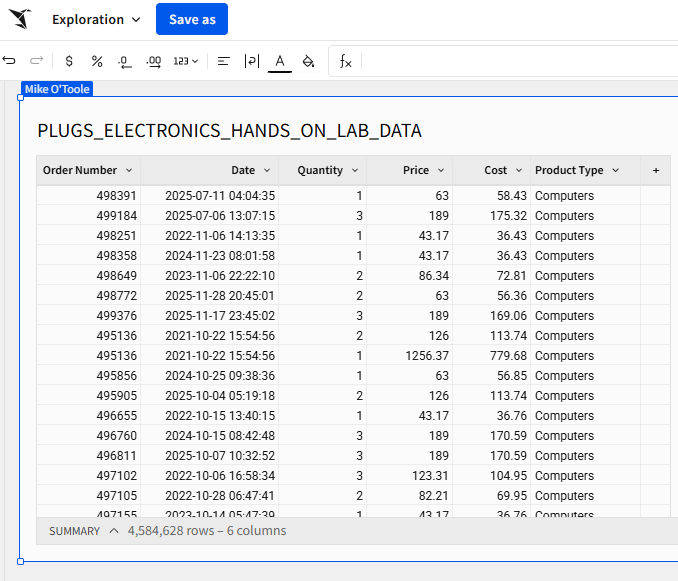
- In the data picker, navigate to:Connections → Sigma Sample Database → Retail / Plugs Electronics → PLUGS_ELECTRONICS_HANDS_ON_LAB_DATAThis “Hands On Lab” table holds SKU-level sales data for Plugs Electronics, including store and customer information.
- Include at least the following columns:
DateQuantityPriceCostProduct Type- An order identifier (for example,
Order Number)

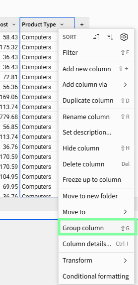
Step 2 – Group the Sigma Table by Product Type
Sparklines work best when the table is grouped, so the sparkline is rendered per group instead of per raw row.
- On the
Product Typecolumn in the table:- Click the down arrow
- Select Group column
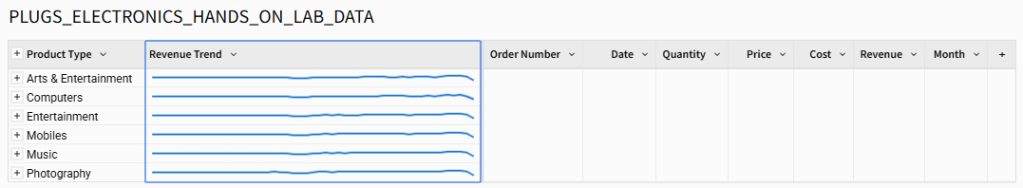
- Collapse the grouping so the table shows one row per Product Type.
Revenue and Profit sparklines will be calculated at this Product Type level.

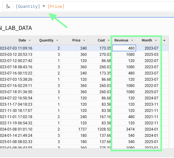
Step 3 – Add Helper Columns: Revenue and Month
These helper columns are reused across both sparklines.
Revenue (row level)
Add a calculated column Revenue:
[Quantity] * [Price]
Month (row level)
Add another calculated column called Month with the following formula:
DateTrunc("month", [Date])
Month will serve as the X-axis for both sparklines so they share the same time grain.
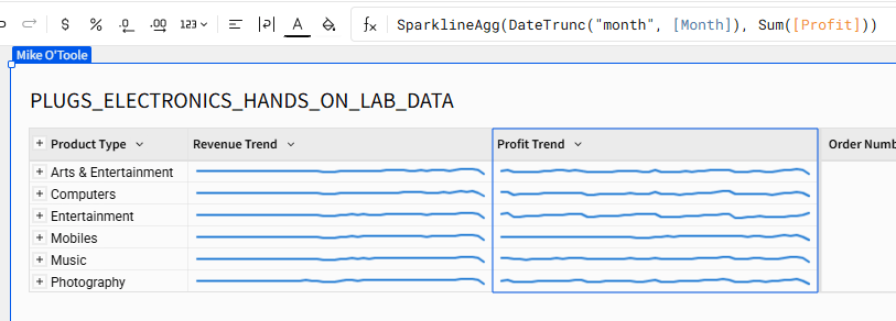
Step 4 – Build a Revenue Sparkline with SparklineAgg
The SparklineAgg function creates a sparkline by aggregating a measure over a category.
SparklineAgg(category, aggregate)
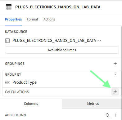
To make the sparkline respect the Product Type grouping, create it as a group calculation instead of a detail-level column:
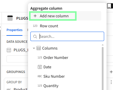
- In the right editor panel under Groupings → Product Type, find Calculations.
- Click Add calculation.
- Enter in the formula bar:
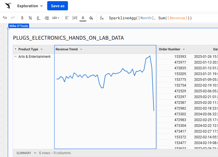
SparklineAgg([Month], Sum([Revenue])) - Press Enter.
For each Product Type, this calculation:
- Uses all
Monthvalues as the category (x) - Aggregates
Revenueper month usingSum([Revenue])as the value (y) - Returns a sparkline object that renders directly in the table
Because the calculation is defined at the group level, collapsing the table to one row per Product Type keeps the sparkline visible.
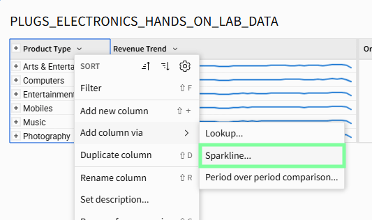
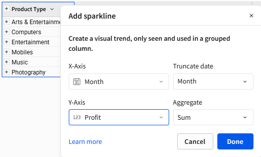
Step 5 – Add a Profit Sparkline via “Add Column via → Sparkline”
The same result can be achieved using the no-code workflow. Profit can be visualized with a separate sparkline, using the same Month grain and Product Type grouping.
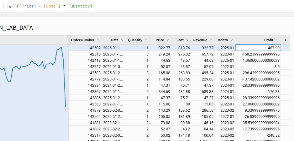
Profit (row level)
Add a calculated column:
([Price] - [Cost]) * [Quantity]
This calculates line-level profit from price, cost, and quantity.
Profit Trend sparkline with Add Column via→Sparkline
- Open the menu on the
Product Typecolumn header. - Choose Add column via → Sparkline.
- Configure the dialog:
- Category (X-axis):
Month - Value (Y-axis):
Profit - Aggregate:
Sum
- Category (X-axis):
- Confirm.
This creates a sparkline column driven by the same logic as SparklineAgg, without writing the formula explicitly.
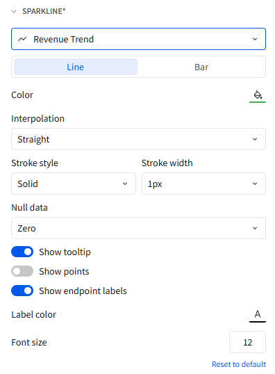
Step 6 – Format Sparklines for Clarity (Two Styles)
Sigma’s sparkline formatting controls are in the Format → Sparkline panel for tables and pivot tables. Using different styles for Revenue and Profit makes them easier to read at a glance.
Revenue Trend as a Clean Line
- Select the table.
- In the editor, open Format → Sparkline.
- Choose
Revenue Trend. - Apply:
- Chart type:
Line - Stroke width: 1px
- Points: Off (no markers)
- Endpoint label: On (show the final value)
- Interpolation: Straight lines
- Color: Single neutral or brand color
- Chart type:
This configuration produces a thin, unobtrusive revenue trend with the current value labeled at the end.
Profit Trend as an Area with Markers
- In Format → Sparkline, choose
Profit Trend. - Apply:
- Chart type:
Line - Stroke width: 1px
- Points: Small markers on each point
- Endpoint labels: Off (the
Total Profitcolumn provides the exact value) - Interpolation: Straight
- Color: Different color as Revenue
- Chart type:


UX Best Practices for Sparklines in Sigma
A few simple design rules keep sparkline tables readable:
1. Use sparklines to support numeric metrics, not replace them.
- Keep Total Revenue and Total Profit as numeric columns.
- Use sparklines to show direction and volatility.
2. Limit the number of sparkline columns.
- One or two sparkline columns per table is usually enough.
- More than that starts to look like visual noise.
3. Keep the time grain consistent.
- Use the same
DateTrunc("month", …)(or whatever grain you choose) for every sparkline in the table.
4. Make each sparkline visually distinct but restrained.
- Revenue: minimalist line with an endpoint label.
- Profit: line with markers, no text labels, different color as Revenue.
Performance Considerations: Sparklines vs Warehouse Cost
Behind the scenes, Sigma:
- Queries the warehouse (Snowflake, Databricks, etc.) to retrieve the grouped dataset.
- Uses caching and in-browser calculations for many follow-on computations.
When a table is already grouped, additional group-level calculations such as SparklineAgg can often be computed against the cached result, rather than triggering a fresh query, as long as the dataset is not excessively large and cache settings allow it.
Practical guideline:
- Reasonable: One row per Product Type (or Store/Region) with a couple of sparkline columns.
- Unreasonable: Attempting to render sparklines at raw transaction grain.
Keeping the underlying table at a sensible grain provides the benefits of sparklines in Sigma without unnecessary load on the warehouse.
Wrap-Up
Using the Plugs Electronics hands-on lab data in the Sigma Sample Database, a single Sigma table element grouped by Product Type can show:
- Aggregated revenue and profit
- Separate revenue and profit sparklines per Product Type
The combination of SparklineAgg and the “Add column via → Sparkline” workflow provides a reusable pattern for adding compact trend context to grouped tables across other datasets as well.
Contact Us
If you would like to talk to someone at Maverick Data about maximizing your usage of the Sigma platform, please email us at spencer@maverickdata.io for more information!